
New Confluence interface makes for better productivity
At Summit Barcelona this March, when Atlassian revealed they were transforming the user interface for Jira, Confluence, and other products. There was a noticeable gasp from the audience. Fear of change perhaps?
We all know that once we get used to working in a particular way day in day out with the same software we reel at the words significant and update. Well, fear not! I assure you the update is wonderfully intuitive!
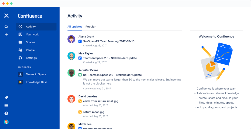
All of the navigation elements are now on the left hand panel, and the global header removed. The side bar can be expanded or contract as needed, leaving plenty of screen real estate to focus on creating content.
Here are our thoughts on the Confluence changes:
Dave says:
In general I’m pleased with how the new design makes it easier to move between applications. My favorite feature at the moment is the Confluence side bar and how it allows more screen real estate, especially on laptops.
Cal Newport coined the phrase ‘Deep Work’. He talks about the way design changes have simplified interfaces, making it easier to concentrate on cognitively demanding tasks where your aim is to complete work without distraction. Atlassian has taken the first step and improved their interface making it easier to work with. Less clutter, fewer distractions.
Emma says:
I really like the update, it definitely makes the application much easier to use. In addition, I love the “Your Work” option (which I use all the time) to get back to the content you were working on or quickly head over to your favorited pages.
Overall, I love the simplicity of it, although the left navigation bar for the dashboard is slightly cluttered when you’re on the dashboard and you’re an administrator. My favorite feature is the way pages are displayed in the space view. This makes it much easier to find content quickly.
It took me a while to find how to log out and how to get to the profile links. They been moved down to the bottom left-hand area. For example, i’ve indicated where this is in the screen shot below.
I also really like this quick link to space pages, and the link to reorder them in the top right-hand area of the interface. Really helps to jump into the content and make sure that you’re keeping it organised.
Just as moving crockery around in your kitchen cupboards means you keep going to the wrong one, I keep going to the search bar at the top of the interface instead of to the side panel. Some useful tips below to help you out with this.
Some top tips:
Atlassian says, “We’ve got big plans for Confluence individually, and for the way it works together with other Atlassian Cloud apps for even better team collaboration.” I’m excited to find out what else is in store for us. Maybe more will be revealed at Summit in San Jose! We’ll be talking about what we learned at Summit so make sure you check back for the latest news.
Here’s a quick video overview from Dave.